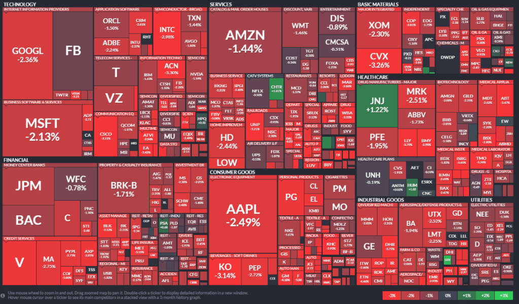
Below is “heat map” from http://www.finviz.com. This is a great tool to see market movement. According to Finviz, this heat map is drawn from the S&P 500 and categorized by sectors and industries of those companies.
As we all know, red is an indication of negative movement and green is movement in the positive direction. However, the most interesting aspect of this heat map is how much of it is red. This is an example of the market and consumer having concerns. The market is on edge and the lower than expected jobs report is just the latest issue for investors. As it stands today, every sector and almost all companies are down for the day.
This is just some food for thought, I will have a more detailed sector analysis coming this week.